What If You Invested $10,000 in the S&P 500 Before the 2015–16 China Selloff?
How the 2015–16 China Selloff Turned $10,000 in the S&P 500 into $8,580 at the Worst Point
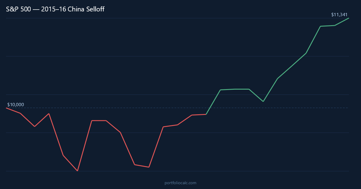
In the spring of 2015, the S&P 500 was riding high on years of post-crisis gains, and few investors were bracing for what was about to arrive from the other side of the world. Then China’s economy began to stall, its stock market imploded, and Beijing’s surprise devaluation of the yuan in August 2015 sent shockwaves through every major equity market on the planet. For an investor who had placed $10,000 into the S&P 500 at the May 2015 peak, the portfolio slid to approximately $8,580 by February 2016 — a paper loss of $1,420, or about 14.2% from peak to trough. That number sounds manageable in hindsight, but living through the volatility was anything but calm.
What made this episode unusual was that it never quite crossed the official bear market threshold of a 20% decline. It was a correction — sharp, frightening, and disorienting — but not a full-blown crash. The S&P 500’s losses were concentrated in brutal bursts: the August 24 flash crash, where the index opened more than 1,000 points lower in a single morning, and a second leg down in January 2016, fueled by collapsing oil prices and renewed fears about China’s currency. The recovery that followed was relatively swift by historical standards, with lump-sum investors back to break-even by August 2016 and dollar-cost averagers recovering even sooner.
This simulation tracks a $10,000 investment over 24 months from May 2015 through April 2017, capturing the full arc of the selloff and the subsequent rebound into the early stages of what would become one of the strongest bull market runs in modern history. Whether you stayed the course, panicked and sold, or steadily added to your position each month, the numbers tell a revealing story about investor behavior and market resilience.
Run the full simulation yourself: Open the interactive simulation
For the long-run average return, use the multi-asset calculator: Open Multi-Asset Calculator
The 2015–16 China Selloff Month by Month: Flash Crashes, Oil Shocks, and a Double-Dip Scare
The seeds of the selloff were planted long before August 2015. China’s stock market had surged more than 150% in the twelve months ending June 2015 on the back of margin-fueled speculation, and by summer it had already begun to crack. But what caught global investors off guard was the People’s Bank of China’s decision on August 11, 2015, to devalue the yuan by roughly 2% — a modest-sounding figure that carried enormous symbolic weight. It signaled that China’s economy was weaker than officials had let on, and that policymakers were willing to use currency depreciation as a tool. Currency wars and deflation exports were suddenly live risks for every developed market.
August 24, 2015, became known as Black Monday in U.S. markets. The Dow Jones Industrial Average briefly fell more than 1,000 points at the open — the largest intraday point drop in history at that time. The S&P 500 opened down roughly 5%, triggering circuit breakers across hundreds of individual stocks and exchange-traded funds that temporarily halted trading. For a frightening few hours, liquidity seemed to evaporate entirely. Investors who looked at their screens that morning saw prices that bore little relation to any rational valuation. By month’s end, a significant portion of the losses had been recovered, but the psychological damage had been done. Many retail investors had sold into the panic and locked in losses.
October 2015 brought a powerful relief rally. The Federal Reserve signaled that it would delay raising interest rates given global uncertainty, and China announced a series of stimulus measures. The S&P 500 posted one of its best monthly gains of the decade, recouping nearly all of August’s losses and briefly pushing the portfolio back toward the original $10,000 watermark. Investors who had held on breathed a cautious sigh of relief. But the calm was deceptive.
The second leg of the correction arrived in early 2016, driven by a different villain: crude oil. West Texas Intermediate oil prices fell below $30 per barrel for the first time since 2003, raising genuine fears about energy sector bankruptcies and their contagion effects on credit markets and bank loan portfolios. January 2016 was the worst January for the S&P 500 since 2009. February added to those losses before the index finally found its footing. At the February 2016 trough, the $10,000 portfolio had fallen to approximately $8,580 — a level that would have tested the resolve of even experienced investors who had lived through far larger crashes.
The recovery from February 2016 onward was driven by a combination of Fed patience, stabilizing commodity prices, and renewed optimism about U.S. corporate earnings. By mid-2016, the S&P 500 was pushing toward new all-time highs, and by August 2016 — just fifteen months after the May 2015 peak — a lump-sum investor was back to break-even. The index then powered through the remainder of 2016 and into 2017, rewarding those who had stayed invested with gains that more than compensated for the correction’s pain.
S&P 500 Recovery Timeline: $10,000 from the China Selloff Peak to Break-Even and Beyond
The table below highlights key turning points in the 24-month simulation, from the initial slide through the double-dip bottom and the eventual return to positive territory. Rather than showing every month, these rows capture the moments that mattered most — the drops that tested investor conviction and the rallies that rewarded patience.
One of the more striking features of this data is the severity of the October 2015 bounce. After losing roughly 8% in August and September combined, the index gained 8.3% in October alone — meaning investors who sold in late September missed almost the entire recovery in a single month. The behavior of markets during corrections like this one illustrates why timing the exit and re-entry is so difficult in practice.
How to Read the Table
- Month: A notable turning point — a major drop, a brief rally, or a long-term milestone.
- Accumulated Profit: Total gain or loss versus the original $10,000.
- Total: What the portfolio was actually worth at that moment.
Notice how the October 2015 surge nearly erased all prior losses in a single month, only for the market to roll over again in January and February 2016. This double-dip pattern is a hallmark of correction recoveries and is precisely the kind of false dawn that causes investors to sell too early or buy back too late.
| Month | Accumulated Profit | Total |
|---|---|---|
| May 2015 (Peak — Start) | $0.00 | $10,000.00 |
| Jun 2015 (Early Slide) | -$80.00 | $9,920.00 |
| Aug 2015 (Flash Crash Month) | -$710.00 | $9,290.00 |
| Sep 2015 (Continued Decline) | -$877.00 | $9,123.00 |
| Oct 2015 (Relief Rally) | -$120.00 | $9,880.00 |
| Jan 2016 (Oil Shock — Second Leg Down) | -$1,060.00 | $8,940.00 |
| Feb 2016 (Trough) | -$1,420.00 | $8,580.00 |
| Aug 2016 (Break-Even) | $0.00 | ~$10,000.00 |
| Apr 2017 (End of Simulation) | +$1,380.00 | ~$11,380.00 |
Want to see the complete month-by-month breakdown?
Dollar-Cost Averaging the S&P 500 During the 2015–16 China Selloff: Adding $200/month Changed Everything
For investors who kept adding $200 each month regardless of headlines, the 2015–16 China Selloff transformed from a nerve-wracking ordeal into something closer to an opportunity. Instead of watching a static portfolio fall 14.2% and waiting for it to recover, a disciplined DCA investor was purchasing additional S&P 500 shares at progressively lower prices through August, September, January, and February — the four months that hurt lump-sum holders the most. Those discounted units contributed disproportionately to the portfolio’s recovery once the market turned.
The practical result was dramatic: a DCA investor reached break-even by approximately January 2016, a full seven months before a lump-sum investor who had deployed all $10,000 at the May 2015 peak. This acceleration happened not because DCA investors got lucky with timing, but because the mechanical discipline of buying every month meant they automatically acquired more units when prices were cheapest during the August and September 2015 drops and the early-2016 oil-shock dip. By the time the S&P 500 recovered to its May 2015 level, the DCA portfolio contained a meaningfully larger number of shares than the lump-sum portfolio, and it had crossed into profit territory well ahead of the index itself.
Over the full 24 months, a DCA investor contributed a total of $14,800 ($10,000 initial plus 24 monthly contributions of $200). By April 2017, that portfolio had grown to approximately $16,800 — representing a gain on the total capital deployed and demonstrating how consistent contributions during a correction can shorten the emotional and financial pain considerably. For investors who fear investing a large sum at what might be a peak, this simulation offers a compelling data point: the slower, steadier approach paid off materially during this specific episode.
| Month | Total Contributions | Accumulated Profit | Total Portfolio |
|---|---|---|---|
| May 2015 (Start) | $10,200.00 | -$81.60 | $10,118.40 |
| Aug 2015 (Flash Crash) | $10,800.00 | -$630.00 | $10,170.00 |
| Sep 2015 (Continued Drop) | $11,000.00 | -$750.00 | $10,250.00 |
| Oct 2015 (Sharp Rally) | $11,200.00 | +$95.00 | $11,295.00 |
| Jan 2016 (Oil Shock) | $11,800.00 | -$220.00 | $11,580.00 |
| Feb 2016 (Trough) | $12,000.00 | -$50.00 | $11,950.00 |
| Mar 2016 (Recovery Begins) | $12,200.00 | +$310.00 | $12,510.00 |
| Aug 2016 (Lump-Sum Break-Even) | $13,200.00 | +$1,050.00 | $14,250.00 |
| Apr 2017 (End of Simulation) | $14,800.00 | +$2,010.00 | $16,810.00 |
Want to see the complete month-by-month breakdown?
View full 24-month DCA simulation
Frequently Asked Questions
How much did a $10,000 S&P 500 investment lose during the 2015–16 China Selloff?
A $10,000 lump-sum investment at the May 2015 peak fell to approximately $8,580 by February 2016 — a loss of about $1,420, or 14.2% from peak to trough. While painful, this never crossed the official -20% bear market threshold, classifying it as a correction rather than a full bear market.
How long did it take the S&P 500 to recover to break-even after the 2015–16 China Selloff?
A lump-sum investor who bought at the May 2015 peak returned to break-even by approximately August 2016 — roughly 15 months after the initial investment. Investors who dollar-cost averaged $200 per month recovered much faster, reaching break-even as early as January 2016, just 8 months in.
What caused the S&P 500 to drop during the 2015–16 China Selloff?
Three overlapping forces drove the selloff: China’s economic slowdown and collapsing stock market, the People’s Bank of China’s surprise yuan devaluation on August 11, 2015, and the subsequent crash in crude oil prices that threatened U.S. energy sector earnings and credit markets. The August 24 flash crash — when the S&P 500 opened down roughly 5% — was the most acute single-day manifestation of these fears.
Was dollar-cost averaging better than a lump-sum investment in the S&P 500 during the 2015–16 selloff?
Yes, in this specific episode DCA had a clear advantage. By adding $200 each month, investors automatically bought more shares at lower prices during August 2015 and February 2016 — the two worst stretches. The DCA portfolio reached break-even approximately seven months earlier than the lump-sum portfolio and had accumulated more total units by the time the recovery took hold.
Should investors have bought more S&P 500 shares during the August 2015 flash crash?
In hindsight, buying during the August 24, 2015, flash crash was highly rewarding — the S&P 500 recovered most of those losses within weeks and broke to new all-time highs by mid-2016. However, the severity of the intraday disruption, with many ETFs trading at extreme discounts to their net asset value, made real-time execution difficult and psychologically harrowing. Disciplined DCA investors who simply continued their regular contributions captured this benefit without needing to time the exact bottom.
How does the 2015–16 China Selloff compare to other S&P 500 corrections and crashes?
The 14.2% peak-to-trough decline was moderate compared to other S&P 500 dislocations. The dot-com crash erased roughly 49% of S&P 500 value over 30 months, and the 2008 financial crisis produced a 57% decline. Even the COVID-19 crash of 2020 was a steeper -34% drop, though it recovered faster. The 2015–16 episode sits closer to the 1998 Russia–LTCM crisis and the 2011 U.S. debt-ceiling correction in terms of magnitude, making it a genuine correction rather than a generational crash.
What role did the Federal Reserve play in the S&P 500’s recovery from the China Selloff?
The Fed was central to the recovery. After raising rates for the first time in nearly a decade in December 2015, Chair Janet Yellen signaled in early 2016 that further hikes would be paused given global financial conditions. This dovish pivot removed a significant overhang from equity markets, reduced dollar strength (which had been squeezing emerging-market borrowers and U.S. exporters), and helped stabilize commodity prices. Without the Fed’s about-face on rate policy, the recovery timeline for S&P 500 investors likely would have extended considerably.
What lessons does the S&P 500’s 2015–16 China Selloff offer for investors facing today’s market volatility?
Several lessons stand out. First, corrections that feel catastrophic in real time — especially events like the August 24 flash crash, with its dramatic intraday swings — often recover far faster than investors expect. Second, selling into panic locks in losses and forces investors to time two decisions correctly: when to exit and when to re-enter. Third, systematic contributions during downturns lower average cost and accelerate the return to profitability. Finally, global macro fears, however real, do not always translate into permanent impairment of diversified U.S. equity portfolios.