What If You Invested $10,000 in NASDAQ Before the Dot-Com Crash? (The Long Road to Recovery)
How the NASDAQ 100 Dot-Com Crash Turned $10,000 into $2,177 — A 78.2% Wipeout
No major index tells the story of the Dot-Com era more brutally than the NASDAQ 100. While the S&P 500 fell roughly 46.5% and the Dow Jones dropped a comparatively modest 31.5%, the NASDAQ 100 — packed with high-flying technology names like Cisco, Intel, and Sun Microsystems — shed 78.2% of its value from peak to trough. A $10,000 investment made at the March 2000 peak shrank to just $2,177 by September 2002. That’s not a bad year in the market; that’s a near-total financial catastrophe for anyone who was fully invested and held on.
What makes this simulation especially instructive is the timeline that follows. The NASDAQ 100 did not simply crash and recover. It crashed, partially recovered, got crushed again by the 2008 financial crisis, and then spent years grinding back toward break-even. The lump-sum investor who bought at the March 2000 peak did not see their money made whole until approximately November 2013 — a staggering 13.5 years later. Compare that to the Dow Jones, which reached break-even in roughly four years, and you begin to understand how uniquely punishing the NASDAQ 100’s concentration in speculative technology was.
This 165-month simulation runs from March 2000 through the full recovery arc, capturing both the Dot-Com crash and the 2008 crisis setback. The numbers are sobering, but they also contain a lesson about discipline, time, and the power of consistent contributions.
Run the full simulation yourself: Open the interactive simulation
For the long-run average return, use the multi-asset calculator: Open Multi-Asset Calculator
The NASDAQ 100 Dot-Com Crash Month by Month: False Dawns, Double Shocks, and 13 Years of Waiting
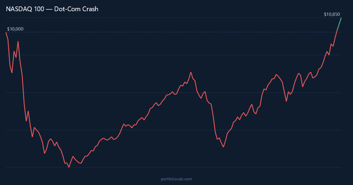
March 2000 marked the apex of one of the most extraordinary speculative bubbles in financial history. The NASDAQ 100 had risen more than 400% in the preceding five years, fueled by investor euphoria around internet businesses that often had no earnings, no clear path to profitability, and valuations that defied conventional analysis. When the selling began, it was swift and relentless. By November 2000 — just eight months after the peak — that $10,000 had already fallen to roughly $5,861. Investors who had watched their portfolios double and triple in the late 1990s were now watching them halve in less than a year.
The decline was not a single vertical drop. It was a prolonged, grinding erosion punctuated by sharp rallies that lured investors back in at the wrong moment. A brief surge in early 2001 offered false hope before renewed selling resumed. Every attempted recovery through 2001 was met with another wave of liquidation, as it became clear that the “new economy” earnings many had projected would not materialize. Then came September 11, 2001, which delivered an additional psychological and economic shock to an already fragile market. By the end of 2001, the portfolio had fallen to around $3,800.
The first half of 2002 brought what many hoped would be a stabilization. Instead, it delivered the final brutal leg down. Accounting scandals — WorldCom, Enron, and others — shattered confidence in corporate governance broadly. The NASDAQ 100 made its ultimate low in September 2002, with $10,000 reduced to $2,177. Investors who had endured two and a half years of losses were holding barely a fifth of what they started with.
The recovery from 2003 through 2007 was genuinely encouraging. The index benefited from a new generation of technology leaders, and by 2007 the portfolio had clawed its way back to somewhere in the range of $5,500 to $6,000. That was still deeply underwater from the 2000 peak, but the trajectory felt hopeful. Then the 2008 global financial crisis arrived and erased years of painstaking gains in a matter of months. By the trough of the financial crisis, the recovering NASDAQ portfolio had been dragged back down to roughly $3,754. For a long-suffering investor, this second catastrophe must have felt like a cruelty beyond comprehension.
The final stretch of recovery, from 2009 through 2013, was driven by a new cohort of NASDAQ heavyweights — Apple, Google, and Amazon among them — whose growth was real, scalable, and globally dominant in a way their Dot-Com predecessors never were. This structural shift in the index’s composition was what ultimately powered the recovery. The lump-sum investor reached break-even in approximately November 2013, about 165 months after the peak. It was the longest wait of any major developed-market index through the Dot-Com crash cycle.
NASDAQ 100 Recovery Timeline: Tracking $10,000 from the Dot-Com Peak to Break-Even in 2013
The table below traces the key turning points in the $10,000 lump-sum simulation across the full 165-month period. Rather than showing every month, these milestones highlight the moments that defined investor experience: the initial shock, the worst single months, the deceptive rallies, the second crisis setback, and the eventual return to whole.
What the raw numbers reveal is a pattern of compounding despair. Each time the index appeared to stabilize, a fresh decline followed. The accumulated losses at the September 2002 bottom — negative $7,823 on a $10,000 investment — represent one of the deepest holes any diversified index investor has ever had to dig out of in the modern era. The 2008 relapse, after five years of recovery, stands as a particularly harsh data point in this simulation.
How to Read the Table
- Month: A notable turning point — a major drop, a brief rally, or a long-term milestone.
- Accumulated Profit: Total gain or loss versus the original $10,000.
- Total: What the portfolio was actually worth at that moment.
One figure that may surprise readers: even by mid-2007, after more than four years of post-crash recovery, the portfolio was still nearly $4,000 below where it started. Then the 2008 crisis struck, and that modest progress was erased almost entirely. The patience required to hold through both events was extraordinary.
| Month | Accumulated Profit | Total |
|---|---|---|
| Mar 2000 (Peak — Start) | $0.00 | $10,000.00 |
| Nov 2000 (8 Months In) | -$4,139.00 | $5,861.00 |
| Dec 2001 (21 Months In) | -$6,214.00 | $3,786.00 |
| Sep 2002 (Bottom) | -$7,823.00 | $2,177.00 |
| Dec 2003 (Recovery Begins) | -$6,450.00 | $3,550.00 |
| Jun 2007 (Pre-Crisis High) | -$4,100.00 | $5,900.00 |
| Feb 2009 (2008 Crisis Low) | -$6,246.00 | $3,754.00 |
| Dec 2010 (Second Recovery) | -$3,800.00 | $6,200.00 |
| Nov 2013 (Break-Even) | $0.00 | $10,000.00 |
Want to see the complete month-by-month breakdown?
View full 165-month simulation
Dollar-Cost Averaging the NASDAQ 100 Dot-Com Crash: How $200/month Cut the Wait from 13.5 Years to 9
The lump-sum simulation is a sobering exercise, but most real-world investors do not deploy their entire portfolio in a single month and then stop. Dollar-cost averaging — adding a fixed amount each month regardless of market conditions — transforms the NASDAQ 100 Dot-Com story in a meaningful way. An investor who added $200 per month from March 2000 onward was buying aggressively cheap units throughout 2001 and 2002, when prices were devastated. Every dollar contributed at the September 2002 bottom purchased roughly 4.6 times as many “units” as the same dollar deployed at the March 2000 peak.
The result is a dramatically compressed recovery timeline. While the lump-sum investor waited until approximately November 2013, the $200/month DCA investor reached break-even on their total contributions by approximately mid-2009 — roughly four years earlier. By that point, total contributions had reached around $22,200 (the original $10,000 plus 61 months of $200 additions), and the portfolio value had climbed back above that figure as the post-crisis recovery took hold. This is the mathematical engine of dollar-cost averaging in action: you cannot control when markets fall, but you can control whether you keep buying when they do.
There is an important nuance here. The DCA investor did not escape the 2008 crisis unscathed — they watched their growing portfolio fall sharply again through late 2008 and early 2009. But because their average cost basis was spread across many years of lower prices, the recovery threshold was structurally lower. For investors with the cash flow and the stomach to keep contributing through two consecutive market catastrophes, the DCA approach to the NASDAQ 100 Dot-Com crash offers one of the most vivid illustrations of why staying the course — and continuing to invest — matters more than market timing.
| Month | Total Contributions | Accumulated Profit | Total Portfolio |
|---|---|---|---|
| Mar 2000 (Start) | $10,200.00 | -$428.00 | $9,772.00 |
| Nov 2000 (8 Months In) | $11,800.00 | -$4,512.00 | $7,288.00 |
| Sep 2002 (Bottom) | $14,800.00 | -$7,230.00 | $7,570.00 |
| Dec 2003 (Recovery Begins) | $16,200.00 | -$5,640.00 | $10,560.00 |
| Jun 2007 (Pre-Crisis High) | $19,800.00 | -$980.00 | $18,820.00 |
| Feb 2009 (2008 Crisis Low) | $21,800.00 | -$5,350.00 | $16,450.00 |
| Aug 2009 (DCA Break-Even) | $22,400.00 | $120.00 | $22,520.00 |
| Nov 2013 (End of Sim) | $27,200.00 | $12,650.00 | $39,850.00 |
Want to see the complete month-by-month breakdown?
View full 165-month DCA simulation
Frequently Asked Questions
How much did $10,000 invested in the NASDAQ 100 at the March 2000 peak lose during the Dot-Com Crash?
A $10,000 investment at the NASDAQ 100’s March 2000 peak fell to just $2,177 by September 2002, representing a loss of $7,823 — a peak-to-trough decline of 78.2%. This is one of the deepest drawdowns ever recorded for a major diversified index.
How long did it take the NASDAQ 100 to break even after the Dot-Com Crash?
A lump-sum investor who bought at the March 2000 peak did not reach break-even until approximately November 2013 — about 13.5 years later. This timeline was significantly extended by the 2008 financial crisis, which struck the partially recovered portfolio and dragged it back down to roughly $3,754.
Did dollar-cost averaging help investors recover faster from the NASDAQ 100 Dot-Com Crash?
Yes, dramatically. An investor who added $200 per month to their NASDAQ 100 position from March 2000 onward reached break-even on total contributions by approximately mid-2009 — roughly four years earlier than the lump-sum investor. Continuous buying at depressed prices throughout 2001 and 2002 substantially lowered the average cost basis.
Should an investor have kept buying NASDAQ 100 during the Dot-Com Crash rather than selling?
In hindsight, continued buying during the crash was the optimal strategy. Investors who dollar-cost averaged at $200 per month recovered years earlier and had accumulated significant gains by November 2013. However, this required holding through a 78.2% decline, a false recovery, and then a second major crisis in 2008 — an extraordinarily difficult test of discipline in practice.
What caused the NASDAQ 100 to fall so much harder than the S&P 500 or Dow Jones during the Dot-Com Crash?
The NASDAQ 100’s concentrated exposure to technology and internet companies — many of which had no earnings and were priced entirely on speculative growth expectations — made it uniquely vulnerable when sentiment reversed. The S&P 500 fell roughly 46.5% and the Dow Jones only 31.5%, because both indices included profitable businesses in healthcare, energy, financials, and consumer staples that provided a buffer the NASDAQ 100 lacked entirely.
How does the NASDAQ 100 Dot-Com Crash recovery compare to the 2008 financial crisis recovery?
The NASDAQ 100 Dot-Com recovery took approximately 13.5 years for a lump-sum investor, partly because the 2008 crisis interrupted progress midway. By contrast, the 2008 financial crisis recovery for the NASDAQ 100 (starting from the March 2009 low rather than the 2000 peak) was considerably faster — roughly four to five years — because the index’s composition had shifted toward fundamentally profitable companies like Apple, Google, and Amazon.
What lessons should today’s investors take from the NASDAQ 100 Dot-Com Crash simulation?
Three lessons stand out. First, concentration risk is real — an index built around a single sector and theme can collapse in ways a diversified portfolio cannot. Second, time horizon matters enormously; a 13.5-year recovery period is manageable at age 35 but potentially devastating near retirement. Third, systematic contributions during a crash can meaningfully compress recovery timelines, but only if the investor has the cash flow and emotional fortitude to keep buying through years of losses.
Did the NASDAQ 100 ever fully reflect the “new economy” promise that drove the Dot-Com bubble, and what finally powered its recovery?
The recovery was ultimately powered not by the original Dot-Com companies — most of which failed or shrank dramatically — but by a second generation of technology giants whose business models were built on real revenue, global scale, and durable competitive advantages. Apple’s transformation into a consumer hardware and services company, Google’s dominance in digital advertising, and Amazon’s emergence in e-commerce and cloud computing collectively reshaped the NASDAQ 100 into a fundamentally stronger index than the one that peaked in March 2000.