What If You Invested $10,000 in the Dow Jones Before the Dot-Com Crash?
How the Dow Jones Dot-Com Crash Turned $10,000 into $6,470 — and Why That’s Actually a Remarkable Story
When investors recall the Dot-Com crash, they picture total annihilation — portfolios gutted by 70%, 80%, even 90% if they were holding the wrong tech names. But that catastrophic picture belongs almost entirely to the NASDAQ. The Dow Jones Industrial Average told a quieter, more measured story. An investor who placed $10,000 into a Dow-tracking fund at the very peak of January 2000 watched their portfolio fall to roughly $6,470 by October 2002 — a painful 35.3% decline, but a world away from the near-total wipeout that NASDAQ investors endured.
That difference was not luck. It was structure. The Dow tracks just 30 of the largest, most established companies in the United States — names like Boeing, Procter & Gamble, Johnson & Johnson, and General Electric. These were not companies whose valuations depended on eyeballs, click-through rates, or promises of future internet dominance. When the speculative fever broke in early 2000, the Dow absorbed the shock without shattering. Understanding why requires looking at what the index actually contained, and what it deliberately did not.
Run the full simulation yourself: Open the interactive simulation
For the long-run average return, use the multi-asset calculator: Open Multi-Asset Calculator
The Dot-Com Crash Through the Dow Jones Lens: Sector Insulation, False Recoveries, and a Slower Grind Down
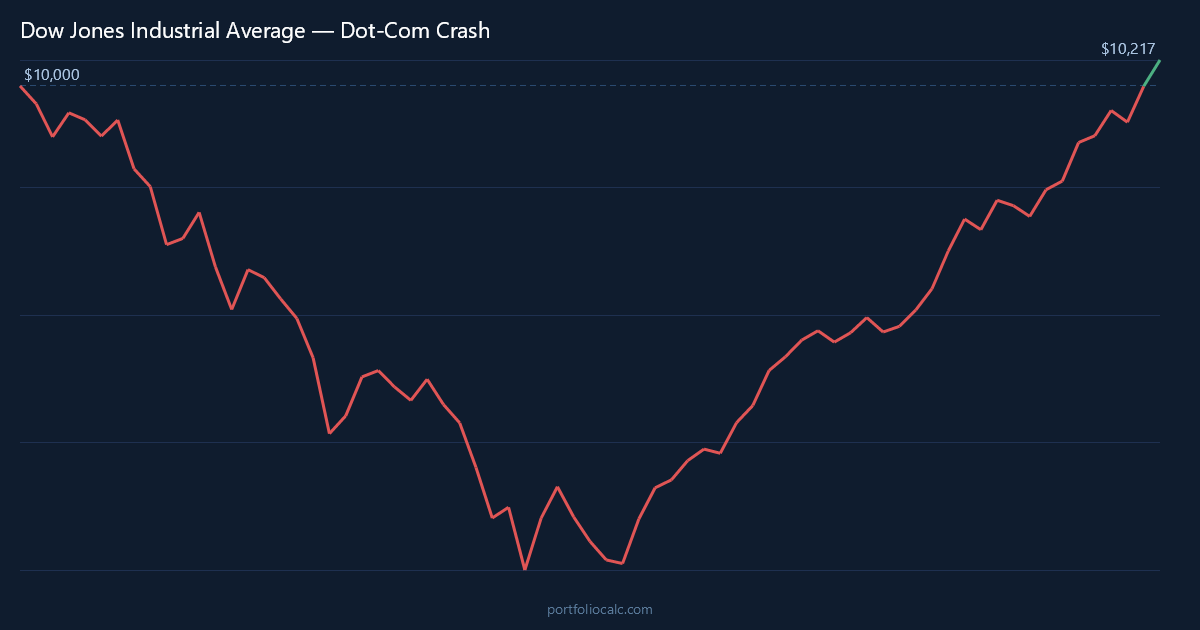
January 2000 was a peculiar moment for the Dow. The NASDAQ had already begun showing cracks — venture-backed companies with no earnings were trading at absurd multiples — but the Dow sat near its all-time high, buoyed by the sense that blue-chip America was participating in the prosperity of the era without having surrendered its fundamentals. Then, almost immediately, the slow bleed began. The index dropped roughly 1.5% in January, then another 2.8% in February, interrupted by a brief positive month before the selling resumed.
What made the Dow’s decline particularly frustrating was its lack of drama. There was no single catastrophic month like the NASDAQ experienced. Instead, the losses came in waves — a bad month, a small recovery, another bad month. By September 2000, the Dow had shed more than 5% in a single month, and investors who had been reassured by the index’s blue-chip composition began to wonder whether they were truly insulated after all. The answer, as the data shows, was: mostly yes, but not entirely.
The events of September 11, 2001 delivered a shock that had nothing to do with tech valuations. The Dow fell more than 8% in a single month — its worst reading in the entire simulation. Yet what followed was equally striking: a sharp 7.3% rebound in October 2001, one of the index’s strongest single months in years. This whipsaw pattern — sharp drop, sharp recovery, then gradual decline resuming — defined the Dow’s experience in ways the NASDAQ’s more linear collapse did not.
By the time the Dow reached its trough in October 2002, the decline from peak to bottom had taken nearly 34 months. That is a long time to watch a portfolio shrink. But consider the context: the NASDAQ was still 78% below its peak at that same moment. Dow investors holding industrial companies, consumer staples firms, and financial institutions had lost roughly one-third of their starting value. That is a real loss — but it is the kind of loss that a diversified, patient investor can absorb and recover from without permanently impairing their financial plan.
The recovery that began in late 2002 and accelerated through 2003 was driven by several forces simultaneously: falling interest rates following the Federal Reserve’s aggressive easing cycle, stabilizing corporate earnings among the Dow’s constituents, and a gradual return of institutional confidence in equity markets. Unlike the NASDAQ, which needed the emergence of an entirely new technology cycle to recover, the Dow simply needed the macro environment to normalize — a meaningful distinction that explains why break-even arrived in roughly December 2003, just four years after the peak.
Dow Jones Dot-Com Recovery Timeline: From $10,000 at Peak to Break-Even in About 4 Years
The table below traces key milestones in the Dow Jones simulation, starting from a $10,000 lump-sum investment made at the January 2000 peak. Each row represents a moment of significance: a sharp drop, a false recovery, the ultimate trough, and the gradual climb back to break-even. Rather than showing every month of the 70-month simulation, these entries are selected to give the clearest picture of the journey an investor would have experienced.
What stands out immediately is the relative shallowness of the losses compared to what NASDAQ investors faced. Even at the absolute worst moment — October 2002 — the portfolio still retained $6,470 of its original $10,000. That remaining capital was still working, still compounding each time the market ticked upward. The investor who stayed the course did not need a miracle to recover; they needed time and the absence of panic selling.
How to Read the Table
- Month: A notable turning point — a major drop, a brief rally, or a long-term milestone.
- Accumulated Profit: Total gain or loss versus the original $10,000.
- Total: What the portfolio was actually worth at that moment.
One detail worth noting: the September 2001 shock and subsequent October 2001 rebound are both visible in the table, illustrating how exogenous events layered onto the existing tech-driven bear market in ways that were impossible to predict or time. Investors who sold in panic after September’s collapse locked in losses; those who held through October captured the recovery.
| Month | Accumulated Profit | Total |
|---|---|---|
| Jan 2000 (Peak — Start) | $0.00 | $10,000.00 |
| Sep 2000 (Early Shock) | -$1,223.00 | $8,777.00 |
| Dec 2000 (Year-End Low) | -$1,890.00 | $8,110.00 |
| Apr 2001 (Brief Rally) | -$1,470.00 | $8,530.00 |
| Sep 2001 (9/11 Shock) | -$2,610.00 | $7,390.00 |
| Oct 2001 (Sharp Rebound) | -$1,850.00 | $8,150.00 |
| Oct 2002 (Trough) | -$3,530.00 | $6,470.00 |
| Jun 2003 (Recovery Builds) | -$940.00 | $9,060.00 |
| Dec 2003 (Break-Even) | $80.00 | $10,080.00 |
Want to see the complete month-by-month breakdown?
Dollar-Cost Averaging the Dow Jones Dot-Com Crash: Adding $200/month Meant Breaking Even in Just 2 Years
For investors who were not investing a single lump sum but rather contributing $200 each month — as many retirement savers naturally do — the Dow Jones Dot-Com crash was a surprisingly brief setback. Because the Dow’s decline was gradual rather than catastrophic, those monthly $200 contributions were purchasing additional shares at prices that were only modestly discounted at first, then more significantly discounted as the bear market deepened. Each contribution lowered the effective average cost of the entire position.
The arithmetic of dollar-cost averaging during a shallower bear market is actually more nuanced than during a deep crash. During a 79% NASDAQ-style collapse, DCA contributions buy shares at dramatically cheaper prices, producing enormous returns when recovery arrives. During a 35% Dow-style decline, the discounts are real but more modest — yet the break-even timeline is dramatically shortened because the index does not need to nearly double just to return to its starting price. For the Dow investor adding $200 monthly, break-even arrived in roughly early 2002, just two years into the bear market.
By the end of the 70-month simulation window, the DCA investor had contributed a total of $14,000 in monthly installments on top of their original $10,000 — $24,000 in total capital deployed. The portfolio value by that point had grown well beyond break-even, reflecting both the recovery in the index and the compounding effect of shares purchased at depressed 2001 and 2002 prices. This is the compounding flywheel that makes systematic investing so powerful: the crash is not the enemy, it is the discount window.
| Month | Total Contributions | Accumulated Profit | Total Portfolio |
|---|---|---|---|
| Jan 2000 (Start) | $10,200.00 | -$153.00 | $10,047.00 |
| Jun 2000 (6 Months In) | $11,200.00 | -$387.00 | $10,813.00 |
| Dec 2000 (Year 1 End) | $12,400.00 | -$562.00 | $11,838.00 |
| Jan 2002 (DCA Break-Even) | $14,600.00 | $120.00 | $14,720.00 |
| Sep 2001 (9/11 Shock) | $13,800.00 | -$910.00 | $12,890.00 |
| Oct 2002 (Index Trough) | $15,800.00 | -$1,240.00 | $14,560.00 |
| Jun 2003 (Strong Recovery) | $17,200.00 | $1,870.00 | $19,070.00 |
| Dec 2003 (Lump-Sum Break-Even) | $18,400.00 | $3,410.00 | $21,810.00 |
| Sep 2005 (End of Window) | $23,800.00 | $7,960.00 | $31,760.00 |
Want to see the complete month-by-month breakdown?
View full 70-month DCA simulation
Frequently Asked Questions
How much did a $10,000 Dow Jones investment lose during the Dot-Com crash?
A $10,000 lump-sum investment in the Dow Jones at the January 2000 peak fell to approximately $6,470 at the October 2002 trough — a loss of about $3,530, or 35.3%. While that is a significant decline, it pales in comparison to the NASDAQ’s roughly 79% peak-to-trough collapse over the same period.
How long did it take for the Dow Jones to break even after the Dot-Com crash?
A lump-sum investor who bought at the January 2000 peak reached break-even in approximately December 2003 — roughly four years later. This recovery period was dramatically shorter than the NASDAQ’s, which took until around 2015 to fully reclaim its year-2000 peak on a price basis.
Did dollar-cost averaging $200/month into the Dow Jones speed up recovery during the Dot-Com crash?
Significantly. An investor adding $200 per month to their initial $10,000 reached break-even in approximately early 2002 — just two years after the peak, and roughly two years ahead of the lump-sum investor. The ongoing contributions continuously lowered the average cost basis, making it far easier to return to profitability even while the index was still declining.
Why did the Dow Jones fall so much less than the NASDAQ during the Dot-Com crash?
Index composition was the defining factor. The Dow Jones tracks only 30 large, established companies spanning industrials, consumer staples, healthcare, and financials — sectors with real earnings and tangible assets. The Dot-Com bubble was concentrated almost entirely in technology and telecommunications. Because the Dow held very little exposure to the speculative tech names driving the NASDAQ’s valuation, it was largely insulated from the sector-specific collapse.
Would it have been better to invest in the Dow Jones or the NASDAQ going into the Dot-Com crash?
For capital preservation during the crash itself, the Dow was dramatically better: a 35.3% drawdown versus the NASDAQ’s approximately 79%. The Dow also recovered in about 4 years versus the NASDAQ’s 15 years to reclaim its 2000 peak. However, the NASDAQ generated far superior long-run returns once the recovery cycle matured, particularly after 2010. The answer depends entirely on the investor’s time horizon and tolerance for volatility.
How did the September 11, 2001 attacks affect a Dow Jones investment during the Dot-Com crash?
The September 2001 shock caused the single worst monthly decline in the simulation — approximately 8.2% — temporarily pushing the portfolio down to around $7,390 from $10,000. However, October 2001 produced a sharp 7.3% rebound, recovering much of that loss within a single month. Investors who panic-sold in September locked in losses that those who held through October naturally recovered.
How does the Dow Jones Dot-Com experience compare to the 2008 financial crisis for the same index?
The 2008 financial crisis was actually worse for the Dow than the Dot-Com crash. The financial crisis produced a peak-to-trough decline of roughly 54% for the Dow — significantly deeper than the 35.3% Dot-Com drawdown. The 2008 crisis hit financial stocks directly, which are a meaningful Dow component, whereas the Dot-Com crash largely bypassed the Dow’s heavily industrial and consumer-oriented composition.
What does the Dow Jones Dot-Com crash teach today’s investors about index selection and sector diversification?
The central lesson is that index composition is a form of risk management. When a bubble is concentrated in a specific sector, broad indices with low exposure to that sector act as a natural hedge. Today’s investors should be aware that the S&P 500 and particularly the NASDAQ are now heavily weighted toward technology and mega-cap growth stocks — meaning a future tech-driven correction could produce very different outcomes depending on which index an investor tracks. Diversifying across sectors, geographies, and asset classes remains as relevant today as it was in 2000.